
Index
Design and Build Quality
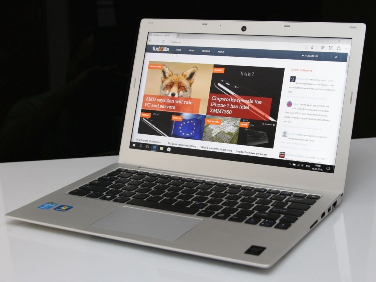
Obviously, the Martian A8 takes its design cue from the Apple MacBook Air series. This means that the Martian A8 inherits the good looks and nice proportions of the MacBook Air line, but what about the build quality?
Taking a closer look at the Martian A8 from different angles gives you a reassuring feeling of a solid build and good choice of materials. The chassis is a combination of a nicely machined magnesium – aluminum alloy and plastic parts. It’s very sturdy.
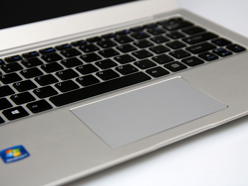
The keyboard and the spacious touchpad are built precisely and perform without a glitch. The oversized touchpad left a very good impression.
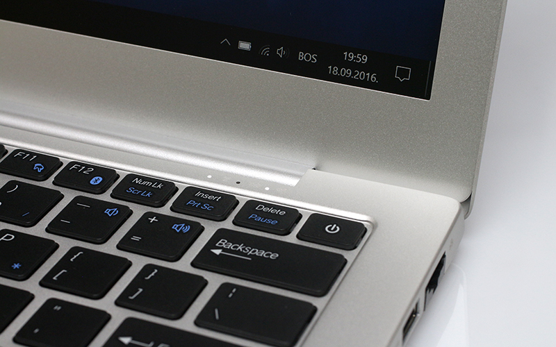
The far right corner of the keyboard holds the power button, another MacBook Air design element. Three small, unobtrusive status LEDs also reside in this corner. Notice the odd corner of the screen lid? We will come back to it a bit later.
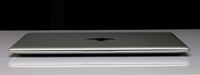
As you’d expect from an Air clone, the front edge of the notebook is very thin and elegant, measuring 15mm in height without the rubber feet.
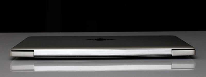
The back is, of course, port – free and cleanly designed, measuring 20mm without the rubber feet.
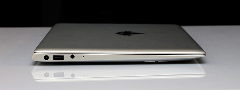
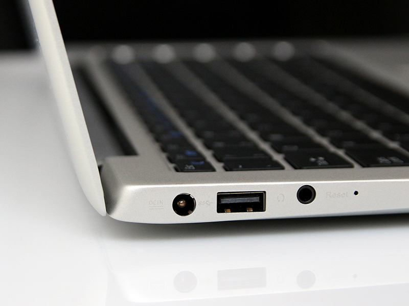
The left side houses the power connector, a USB 2.0 and a 3.5mm headphones port, and interestingly, a small reset button, much like the ones found on routers.
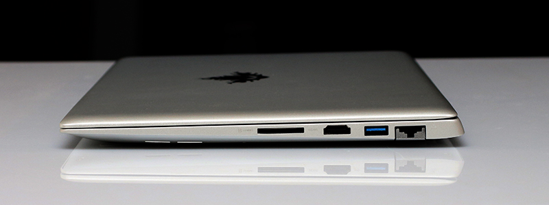
The right side of the notebook features the SD card reader, a standard HDMI port, a USB 3.0 port and a blast from the past - an RJ-45 LAN connector.
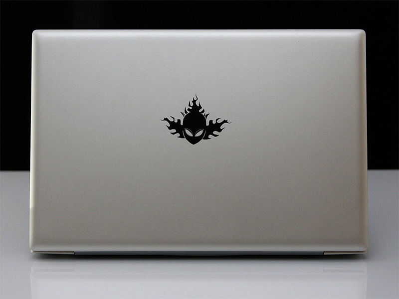
The thin screen lid (measuring 5mm) shows off the company logo, a flaming skull that sort of resembles the Alienware logo with a Bernie Sanders wig on top. The logo would have blended in much better if it was white or gray, rather than black.
Unfortunately, the reassuring solid feeling we mentioned earlier disappears once you pick up and hold the notebook in your hands, or when you take a look at the bottom side of the case.
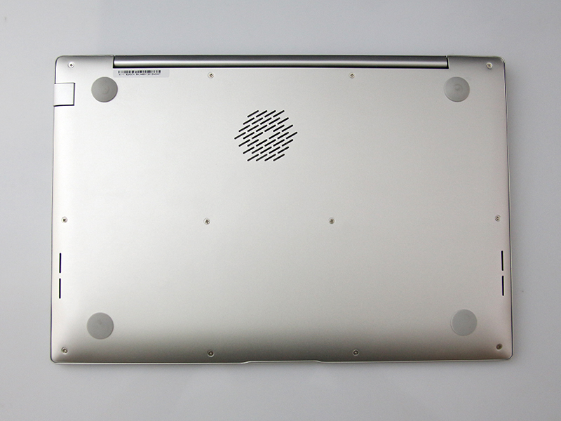
The cooler vents on the bottom of the case ruin the otherwise clean looks. If only they were designed like a horizontal grille, they would have looked much better and blended in with the minimalistic design.
The otherwise solid build quality is let down by the case edges, where the top and bottom halves of the chassis are joined. These edges are too sharp, and the same goes for the screen lid edges.
You can forget about the unappealing cooler vent, but every time you pick up the notebook those sharp edges will be there to greet you.


