Index
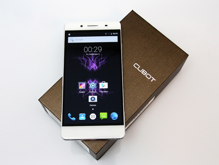
Design and Build Quality
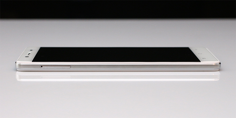
Thin phones usually come with a few caveats; battery capacity tends to be limited, there’s not enough room to squeeze in good camera optics, and it’s trickier to use a powerful processor. At 6.2mm, the Cubot X16 is thinner than an iPhone 6, and it’s the exact same thickness as the Samsung Galaxy A7.
However, the Cubot is not light. It weighs 148 grams, almost as much as some 5.5-inch phablets we had a chance to test. This isn’t exactly a bad thing, because the weight makes the phone feel robust and well put together. But is it really?
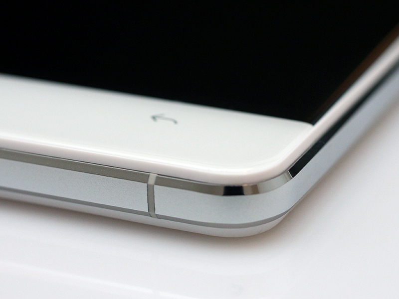
The 4.1mm frame feels great and the finish is good. You will notice some CNC machining irregularities in our macro shots, but they are invisible to the naked eye, unless you look at the edges from a few centimetres (and have good eyes). Build quality is not an issue. In the hand, the X16 feels like a much pricier device and we could not find a single flaw on the frame, plastic bezel, or glass; at least nothing visible with the naked eye. We use a mid-range SLR with a macro lens for some of our product shots, so our shots show a bit more detail than the average human eye can take in.
The thin frame is flanked by plastic bezels, topped off by two panes of glass at the front and back. The front glass is curved (2.5D), while the rear is flat. Cubot claims to use scratch-resistant glass and a 10um double-faced AF film to keep scratches away, so it should prove durable in the long run.
But what about the design itself? Sure, a thin phone can look good, but does the new Cubot pull it off?
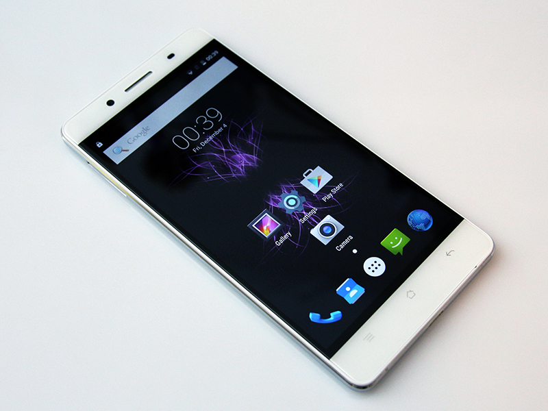
Taste is subjective, but we have to admit we liked it a lot, and so did everyone who had a chance to see it. Geeks can be impressed with specs, but a lot of ordinary consumers just want good looks. The design is minimalistic. Cubot tries to hide the black bezel around the display, stretching it edge-to-edge, which means the phone looks best with a black wallpaper.
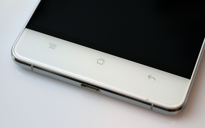
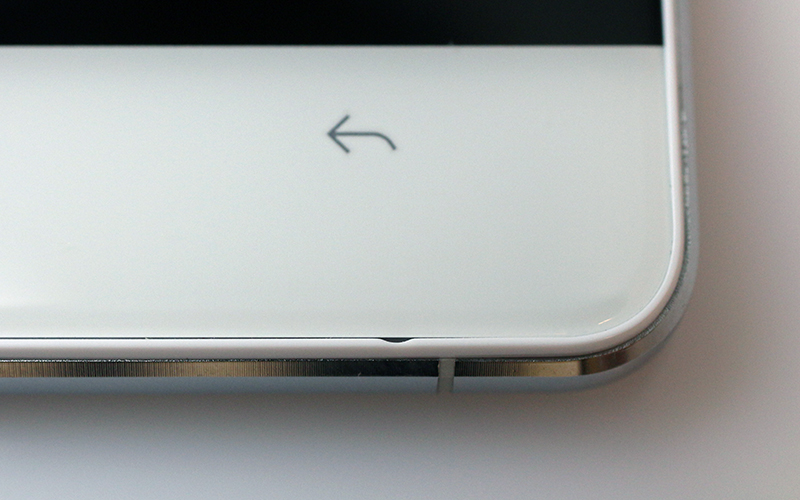
One of our complaints involves the navigation buttons. First of all, they use the old Android icon set, and they’re offset toward the screen, not centred halfway between the panel and bottom. From an ergonomic point of view, this is not a big deal, because the design compensates for the bezel on the bottom of the screen, so the placement of the buttons is spot on, halfway between the bottom and active part of the display, but it just looks a bit weird. Looking at the images of the black version, this isn’t as much of a problem as on the white one, so if you’re an OCD type, you may want to check out the black version instead.
The microphone is not housed on the metal frame, it sits on the leading edge at the bottom. It faces front and to be honest, we can’t even remember the last time we reviewed a phone with a front-facing microphone.
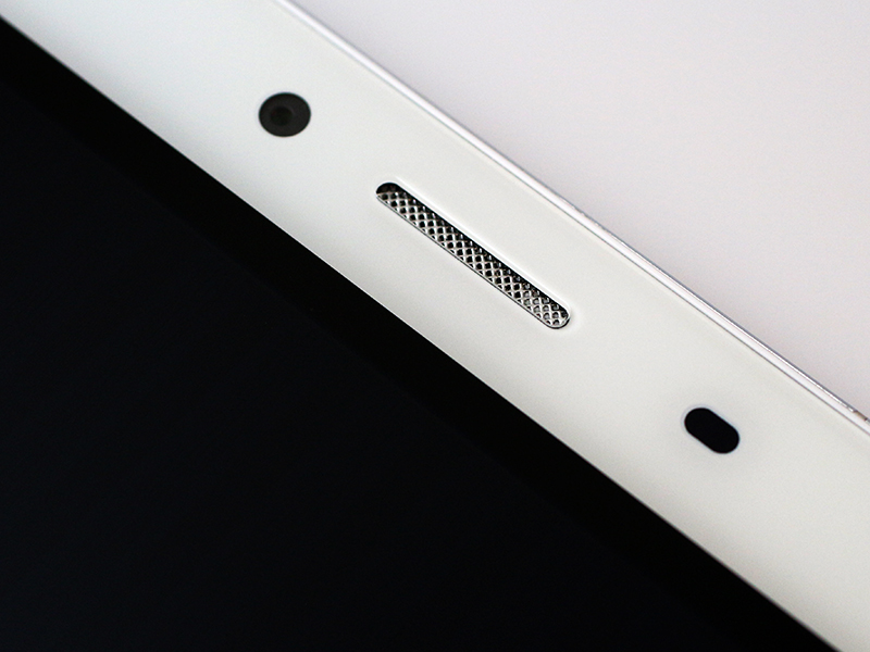
At the top you’ll find the earpiece, selfie cam, light and proximity sensors, and a notification LED. Everything looks ok, and the finish is really good.
Moving to the sides, the 4.1mm thick alloy frame looks and feels impressive. It creates the illusion of an even thinner device.
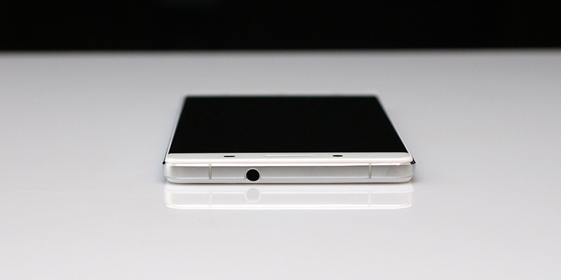
The 3.5mm audio port is at the top.
The SIM tray is on the left.
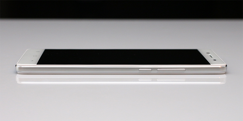
The volume rocker and power button are located on the right. Both are metal and feel good, co complaints here.
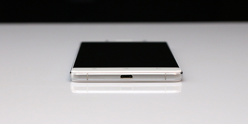
The micro USB port is centred at the bottom.
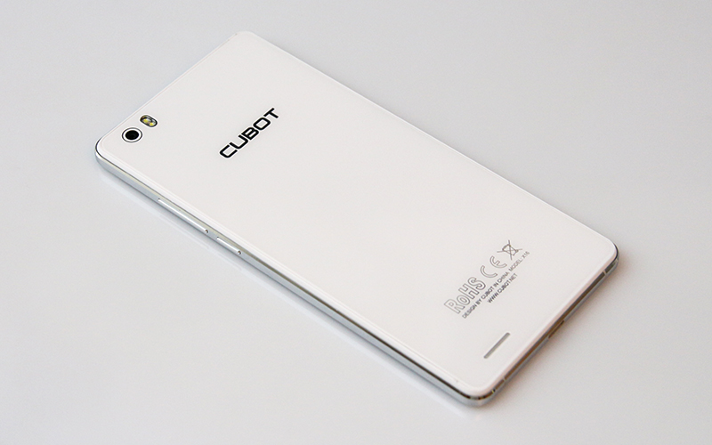
As far as the back goes, we have to admit we had some trouble capturing the real look in our review shots. Although we used a decent camera (and photographer), it’s really hard to capture the “real” look of the glass back. Long story short, it looks better in real life than in our photos.
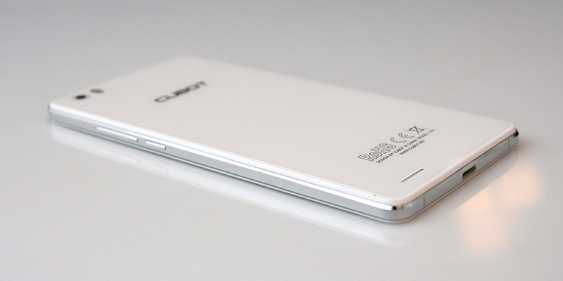
The glass on the back is not curved, so it doesn’t produce those sexy highlights on the edges, like the front glass. You’ll just have to take our word for it, the back looks really good.
The speaker cut-out is located near the bottom, and since the back is flat, it’s muffled when the phone is resting on your desk (something like the original Nexus 4, before Google and LG started adding those tiny plastic humps on the edges).
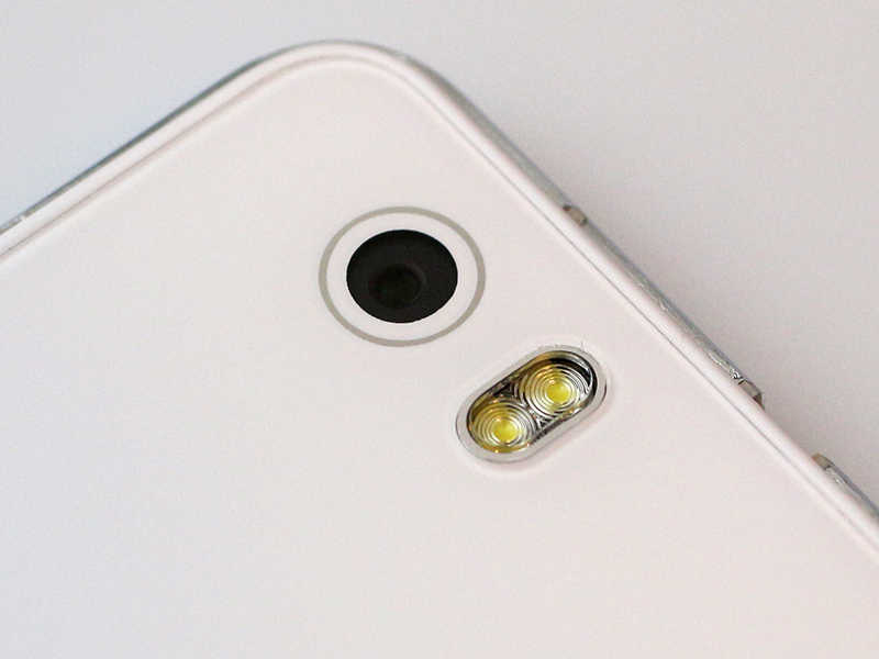
The rear camera and dual-LED flash are located in the top left corner. The camera and flash are (almost) flush with the back.
However, we have to find something to complain about, and in this case it’s the company logo and regulatory stuff at the bottom. Both should have been smaller and understated, considering the minimal design of the phone. It would have looked even better if they were barely visible.
![]()
To sum up, Cubot’s design department did a surprisingly good job. The phone is as thin as the Galaxy A7, which costs three times as much. We also think it looks good, not for a cheap phone, but for any phone. The company did save a bit of money with the oversized plastic bezels surrounding the glass panels, but at this price point it’s understandable and justified.