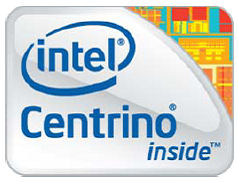
Intel decided to revamp its Centrino logo, which probably wasn't a bad idea, as since its introduction a few years back it has faced criticism by consumers and the press alike. Many found the old logo a bit too tacky, and playful, so the new one should address these concerns.
Off all the designs that are supposed to depict technology, and we find the stylized die part on the top right strangely resembles a couple of NES Zelda levels mashed together. All in all, we like it better than the old one, although the old one has been associated with one of Intel's most successful brands for quite a while now.
Although Intel supposedly rolled out two new logos, to our knowledge only one has surfaced so far, and here it is in its entire splendor.


